I have been very sceptical towards fashion photography recently, since there seemed to be no art left there, but this guy really proved me wrong. I've also been considering not trying to aim to be a fashion photographer anymore, but then again, really inspired by this photographer and might still do some fashion photography in the future.
Looking at various examples of street art and signage systems I have once again come back to the French artist JR.
His TED prize speech is a must to watch (re-posting again)
I wanted to turn my language 2 project into a photography project and I believe that this type of photography is the best signage system in terms of telling the story - and photography is about stories being told. JR's latest project 'the wrinkles of the city' (JR's website)
A few images:
I like that JR is using images of old people, this way reminding of how much history each city contains. Cities like people's faces with all the wrinkles and signs of the time passing.
For my project, therefore, I also wanted to focus on portraits, yet instead of posting it out in the public, I want to focus more on the inside of each person, to explore the freedom within the individual linking it to the topic of the social groups - what makes an individual want to belong to any of those groups at first place. I'd like to also focus my research on the philosophy, sociology and maybe psychology, to create more conceptual images but with an idea behind.
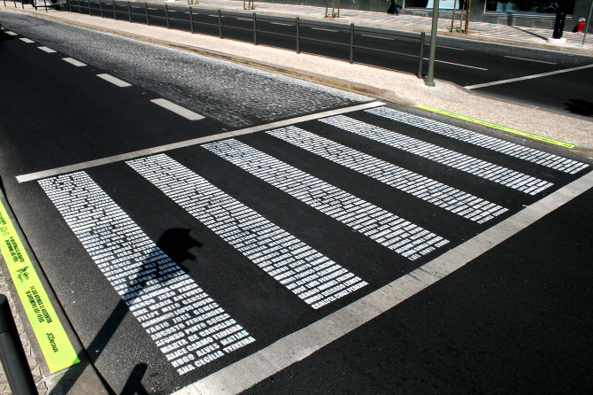
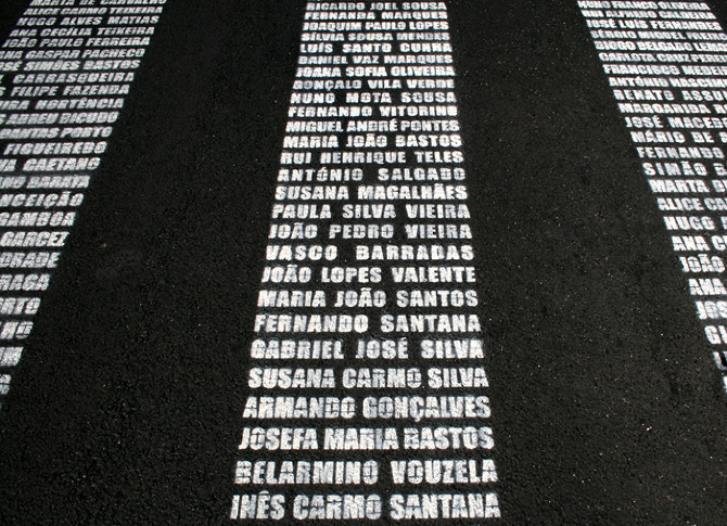
One of the coolest memorial ideas I have seen so far - finally not a random sculpture in a random square, but something that actually has an impact. I assume that these are the names of the people who have died in car accidents. The letters are put in a way that a driver who stops at the crossing would be able to read the names and maybe think before speeding up next time. Brilliant example of information/social design with the use of language and emotions.
although not very related to my information design project, but this project is a lot about the use of language and the concepts that we usually don't think of. Very simple, but some of the ideas really make you think about things. I picked 5 of my favourite math quotes. The website here.
When it comes to the social design and art, JR is definitely one of my most respected and inspirational artists. I also think that this TED talk was one of the best ones I have seen so far.
The Wind Map is a visualisation of the winds in the U.S. Different weights of lines show the strenght of the wind. Beautiful graphics and finally no random circles and lots of distracting colours - makes the wind look beautiful, just like it is in real life. See here.
Some of the craziest information design examples I have ever seen. Apparently, moving graphs have a much bigger impact - I should definitely take my final project into this sphere later.
The iphone part of the talk about how the location data is stored in our iphones without us knowing about it and how it can be used was really interesting to me. I liked Thorp's idea of how the data put into a human context gains meaning - I myself agree to this and believe that this is the idea behind any information design piece that is produced. It has to be put into a human context to be accessible and to be understandable.
a brilliant idea and a perfect example how we trash our and others' everyday lives with useless information - the company prints the tweets from your twitter account on a roll of toilet paper that later gets delivered to your door. Maybe after seeing those on paper one would start thinking more before posting.


.jpg)

